เชิง
| ฟอนต์แบบไม่มีเชิง | |
| ฟอนต์แบบมีเชิง | |
| ฟอนต์แบบมีเชิง (ส่วนสีแดงคือเชิง) |
ในศิลปะการใช้ตัวพิมพ์ เชิง หรือ เซริฟ (serif /ˈsɛrɪf/) คือขีดเส้นเล็ก ๆ ที่มักติดอยู่ที่ปลายขีดเส้นขนาดใหญ่ในตัวอักษรหรือสัญลักษณ์ภายในแบบอักษรหรือกลุ่มแบบอักษร ไทป์เฟซหรือ"ตระกูลแบบอักษร"ที่มีเชิงนั้นเรียกว่า ไทป์เฟซแบบมีเชิง (serif typeface หรือ serifed typeface) ส่วนไทป์เฟซที่ไม่มีเชิงก็เรียกว่าไม่มีเชิง (sans-serif) แหล่งข้อมูลศิลปะการใช้ตัวพิมพ์บางแห่งเรียกไทป์เฟซแบบไม่มีเชิงว่า "วิรูป" (อังกฤษ: grotesque ; เยอรมัน: grotesk) หรือ "Gothic",[1] และไทป์เฟซแบบมีเชิงว่า "อักษรโรมัน"
ต้นกำเนิดและนิรุกติศาสตร์ แก้
เชิงมีต้นกำเนิดมาจากงานเขียนอย่างเป็นทางการภาษากรีกฉบับแรกบนหินและอักษรละตินที่มีตัวอักษรจารึก — กล่าวคือเป็นการแกะสลักบนหินในสมัยโบราณของโรมัน คำอธิบายที่เสนอโดยฟาเธอร์ เอ็ดเวิร์ด คาติช ในหนังสือ The Origin of the Serif เมื่อปี 1968 เป็นที่แพร่หลายในปัจจุบันแต่ยังไม่เป็นที่ยอมรับอย่างเป็นสากล กล่าวคือ โครงร่างอักษรโรมันถูกวาดลงบนหินเป็นครั้งแรก และผู้แกะสลักหินตามรอยพู่กัน ซึ่งบานออกที่ปลายเส้นขีดและมุม, การสร้างเชิงตามอีกทฤษฎีหนึ่งก็คือ เชิงถูกสร้างขึ้นมาเพื่อทำให้ปลายเส้นเรียบในขณะที่สกัดเป็นหิน[2][3][4]
การจัดหมวดหมู่ แก้
ไทป์เฟซแบบมีเชิงสามารถแบ่งกว้างๆ ได้เป็นกลุ่มย่อยหนึ่งในสี่กลุ่ม: เชิงเก่า (Old-style), เชิงหัวเลี้ยวหัวต่อ (Transitional), เชิงดีโดนี (Didone) และเชิงแผ่น (Slab serif) ตามลำดับที่ปรากฏครั้งแรก
เชิงเก่า แก้

ไทป์เฟซแบบมีเชิงเก่า (Old-style) มีอายุย้อนไปถึงปี 1465 ไม่นานหลังจากที่ Johannes Gutenberg เลือกใช้แท่นพิมพ์ประเภทเคลื่อนย้ายได้เครื่องพิมพ์ในยุคแรกๆ ในอิตาลีสร้างรูปแบบที่ฉีกแนวการพิมพ์อักษรนิลของกูเทินแบร์ค โดยสร้างรูปแบบแนวตั้งตรงและตัวเอียงในเวลาต่อมาโดยได้รับแรงบันดาลใจจากการประดิษฐ์อักษรของสมัยฟื้นฟูศิลปวิทยา[5][6] ไทป์เฟซแบบมีเชิงเก่ายังคงได้รับความนิยมในข้อความเนื้อหา เนื่องจากมีรูปลักษณ์ที่เป็นธรรมชาติและสามารถอ่านได้ดีเยี่ยมบนกระดาษหนังสือเนื้อหยาบ ความสนใจที่เพิ่มขึ้นในการพิมพ์ในยุคแรกๆ ในช่วงปลายคริสต์ศตวรรษที่ 19 และต้นศตวรรษที่ 20 ทำให้เครื่องพิมพ์และผู้ก่อตั้งประเภทในสมัยฟื้นฟูศิลปวิทยากลับมาใช้อีกครั้ง ซึ่งหลายแห่งยังคงใช้ชื่อและการออกแบบจนถึงทุกวันนี้[7][8][9]
ไทป์เฟซแบบมีเชิงเก่ามีลักษณะเฉพาะคือความแตกต่างระหว่างเส้นหนาและเส้นบางค่อนข้างน้อย (คอนทราสต์ของเส้นต่ำ) และโดยทั่วไปแล้วจะมีการเน้นในแนวทแยง (ส่วนที่บางที่สุดของตัวอักษรอยู่ที่มุมมากกว่าที่ด้านบนและด้านล่าง). ปกติฟอนต์แบบเก่าจะมีแกนโค้งเอียงซ้าย โดยมีน้ำหนักอยู่ที่ตำแหน่งประมาณ 8 และ 2 นาฬิกา; เชิงมักจะอยู่ในวงเล็บเสมอ (มีเส้นโค้งที่เชื่อมต่อเชิงกับเส้นขีด) ส่วนหัวเชิงมักจะทำมุม[10]
ไทป์เฟซแบบมีเชิงเก่ามีการพัฒนาไปตามกาลเวลา โดยแสดงให้เห็นถึงนามธรรมที่เพิ่มขึ้นจากสิ่งที่ในปัจจุบันถือเป็นลักษณะการเขียนด้วยลายมือและอักษรนิล และมักจะเพิ่มความละเอียดอ่อนหรือคอนทราสต์เมื่อเทคนิคการพิมพ์ได้รับการปรับปรุง[11][12][13] ไทป์เฟซแบบมีเชิงเก่ามักแบ่งย่อยออกเป็น 'เวนิส' (หรือ 'มนุษยนิยม') และ 'การาลเดส' (หรือ 'อัลดีน') ซึ่งเป็นการแยกแยะตามระบบการจัดหมวดหมู่ Vox-ATypI [14] อย่างไรก็ตาม บางคนแย้งว่าความแตกต่างนั้นเป็นนามธรรมมากเกินไป มองเห็นได้ยากยกเว้นเฉพาะผู้เชี่ยวชาญ และบ่งบอกถึงการแยกระหว่างสไตล์ต่างๆ อย่างชัดเจนมากกว่าที่ปรากฏในตอนแรก[15] [b] แบบอักษรสมัยใหม่ เช่น Arno และ Trinité อาจหลอมรวมทั้งสองสไตล์เข้าด้วยกัน [19]
ประเภทโรมัน "มนุษยนิยม" ในยุคแรกเริ่มถูกนำมาใช้ในอิตาลี สร้างแบบจำลองตามสคริปต์ในช่วงเวลานั้น โดยมีแนวโน้มที่จะมีตัว "e" ซึ่งครอสสโตรคเป็นมุม ไม่ใช่แนวนอน "M" ที่มีเชิงสองทาง และมักเป็นสีที่ค่อนข้างเข้มบนหน้ากระดาษ [20] [21] ในยุคปัจจุบัน ไทป์เฟซของนิโคลัส เจนสันได้รับการยกย่องมากที่สุดและมีการกลับมาใหม่หลายครั้ง [22][20] การาลเดสซึ่งมีแนวโน้มที่จะใช้ระดับขีดขวางบนตัว "e" นั้นสืบเชื้อสายมาจากแบบอักษรทรงอิทธิพลในปี 1495 ที่ตัดโดยช่างแกะสลัก Francesco Griffo สำหรับเครื่องพิมพ์ Aldus Manutius ซึ่งกลายเป็นแรงบันดาลใจสำหรับไทป์เฟซหลายแบบที่เกิดขึ้นในฝรั่งเศสตั้งแต่ทศวรรษที่ 1530 เป็นต้นไป[23][24] มักจะเบากว่าบนหน้ากระดาษและทำขึ้นให้มีขนาดใหญ่กว่าที่เคยใช้กับรูปแบบโรมันมาก่อน ไทป์เฟซการาลเดแบบฝรั่งเศสแพร่กระจายอย่างรวดเร็วไปทั่วยุโรปตั้งแต่ทศวรรษที่ 1530 จนกลายเป็นมาตรฐานสากล[23][25]
นอกจากนี้ ในช่วงเวลานี้ก็มีการสร้างตัวเอียงแท้ที่พัฒนาจากไทป์เฟซคนละแนวจากกัน ซึ่งมีจุดประสงค์เพื่อใช้อย่างไม่เป็นทางการ เช่น บทกวีใช้ตัวเอียงแท้ในการเน้น ตัวเอียงแท้นั้นเคยถูกมองว่าเป็นการออกแบบและสัดส่วนที่แยกจากกับแบบโรมัน แต่ต่อมาก็ยอมรับว่าอยู่ในแนวเดียวกับแบบโรมัน โดยเป็นการออกแบบที่เสริมกัน[26][27][28][c]
ตัวอย่างของไทป์เฟซแบบมีเชิงเก่าการาลเดร่วมสมัยได้แก่ Bembo, Garamond, Galliard, Granjon, Goudy Old Style, Minion, Palatino, Renard, Sabon และ Scala ไทป์เฟซร่วมสมัยที่มีลักษณะสไตล์เก่าแบบเวนิส ได้แก่ Cloister, Adobe Jenson, Golden Type, Hightower Text, Centaur, Goudy's Italian Old Style และ Berkeley Old Style และ ITC Legacy การผสมผสานหลายอย่างเหล่านี้ได้รับอิทธิพลจากการาลเดเพื่อให้เข้ากับแนวทางการออกแบบสมัยใหม่ โดยเฉพาะอย่างยิ่งการวางเชิงด้านเดียวบนตัว "M"; Cloister เป็นข้อยกเว้น[30]
แอนทีควา แก้
แอนติควา (Antiqua /ænˈtiːkwə/)[31] เป็นรูปแบบของไทป์เฟซที่ใช้ในการเลียนแบบรูปแบบการเขียนด้วยลายมือหรือ การประดิษฐ์ตัวอักษร ที่พบได้ทั่วไปในช่วงศตวรรษที่ 15 และ 16[32] ตัวอักษรได้รับการออกแบบมาให้ลื่นไหล และลายเส้นเชื่อมต่อกันอย่างต่อเนื่อง ด้วยวิธีนี้ มักจะถูกเปรียบเทียบกับแบบอักษรสไตล์ Fraktur ซึ่งลายเส้นแต่ละเส้นจะแยกออกจากกัน แบบอักษรทั้งสองถูกนำมาเปรียบเทียบกันในโลกของผู้พูดภาษาเยอรมัน ในข้อถกเถียง Antiqua–Fraktur ซึ่งมักจะแบ่งตามแนวความคิดหรือการเมือง หลังจากกลางศตวรรษที่ 20 Fraktur หมดความนิยมและไทป์เฟซแบบ Antiqua ก็กลายเป็นมาตรฐานอย่างเป็นทางการในเยอรมนี (ในภาษาเยอรมัน คำว่า "Antiqua" หมายถึงไทป์เฟซแบบมีเชิง[33])
รสแบบดัตช์ แก้
ไทป์เฟซแบบมีเชิงชนิดใหม่พัฒนาขึ้นในราวศตวรรษที่ 17 ในประเทศเนเธอร์แลนด์และเยอรมนี ซึ่งต่อมาถูกเรียกว่า "รสชาติแบบดัตช์" (ฝรั่งเศส: goût Hollandois)[34] การออกแบบเน้นความหนาแน่นและแข็งทื่อ โดยมักจะมีความสูงของตัวเอ็กซ์ที่สูง (ตัวอักษรตัวพิมพ์เล็กสูง) และความหนาบางของเส้นแตกต่างอย่างชัดเจน ซึ่งอาจได้รับอิทธิพลจากอักษรนิล[35][36][34][37][38]
ศิลปินในสไตล์ "รสแบบดัตช์" ได้แก่ Hendrik van den Keere, Nicolaas Briot, Christoffel van Dijck, Miklós Tótfalusi Kis และประเภท Janson และ Ehrhardt ตามผลงานของเขาและ Caslon โดยเฉพาะขนาดที่ใหญ่กว่า [37]
เชิงหัวเลี้ยวหัวต่อ แก้

ไทป์เฟซแบบมีเชิงหัวเลี้ยวหัวต่อ (Transitional) หรือบาโรก (Baroque) เริ่มแพร่หลายครั้งแรกในช่วงกลางศตวรรษที่ 18 จนถึงต้นศตวรรษที่ 19[39] อยู่ระหว่างแบบอักษร "แบบเก่า" และ "แบบใหม่" จึงเป็นชื่อ "แบบหัวเลี้ยวหัวต่อ" ความแตกต่างระหว่างเส้นหนาและเส้นบางนั้นเด่นชัดกว่าในรูปแบบเก่า แต่ยังไม่ชัดเท่ากับในแบบดีโดนีที่ตามมา มักจะเน้นเส้นแนวตั้ง และบ่อยครั้งที่ตัว "R" มีหางงอ ปลายของสโตรคหลายจังหวะไม่ได้ทำเครื่องหมายด้วยเซอริฟทื่อหรือมุม แต่โดยขั้วต่อลูกปืน ใบหน้าเปลี่ยนผ่านมักจะมีตัวเอียง 'h' ที่เปิดออกไปด้านนอกที่ด้านล่างขวา[40] เนื่องจากแบบหัวเลี้ยวหัวต่อเชื่อมโยงสไตล์เข้าด้วยกัน จึงเป็นการยากที่จะกำหนดว่าไทป์เฟซแบบมีเชิงหัวเลี้ยวหัวต่อนั้นเริ่มต้นและสิ้นสุดที่ใด การออกแบบเฉพาะกาลที่ได้รับความนิยมมากที่สุดหลายชิ้นเป็นการสร้างสรรค์ในภายหลังในสไตล์เดียวกัน
ไทป์เฟซแบบมีเชิงหัวเลี้ยวหัวต่อจากยุคดั้งเดิม ได้แก่ อักษรโรมันในยุคแรกๆ อย่าง "romain du roi" ในฝรั่งเศส จากนั้นเป็นผลงานของ ปิแอร์ ไซมอน โฟร์เนียร์ ในฝรั่งเศสเฟลชแมนและโรซาร์ตในประเทศต่ำ [41] พราเดลล์ในสเปน และจอห์น บาสเกอร์วิลล์และ บัลเมอร์ในอังกฤษ [42] [43] ในบรรดาการออกแบบใหม่ๆ Times New Roman (1932), Perpetua, Plantin, Mrs. Eaves, Freight Text และ "รูปแบบเก่าสมัยใหม่" ก่อนหน้านี้ ได้รับการกล่าวขานว่าเป็นการออกแบบไทป์เฟซแบบมีเชิงหัวเลี้ยวหัวต่อ[d]
ต่อมาไทป์เฟซแบบมีเชิงหัวเลี้ยวหัวต่อในศตวรรษที่ 18 ในอังกฤษเริ่มแสดงอิทธิพลของไทป์เฟซแบบดีโดนีจากยุโรป ดังที่อธิบายไว้ด้านล่าง และไทป์เฟซทั้งสองแบบกลืนเข้าหากัน โดยเฉพาะไทป์เฟซที่มีไว้สำหรับข้อความเนื้อหา เช่น เบลล์[45][46][e]
เชิงดีโดนี แก้

ไทป์เฟซแบบมีเชิงดีโดนี (Didone) หรือแบบทันสมัย (modern) เกิดขึ้นครั้งแรกในช่วงปลายศตวรรษที่ 18 มีลักษณะที่เน้นความแตกต่างระหว่างเส้นหนาและเส้นบาง[f] ไทป์เฟซเหล่านี้มีเน้นเส้นแนวตั้งและเชิงบางๆ ที่มีความกว้างคงที่ โดยมีการถ่ายคร่อมน้อยที่สุด (ความกว้างคงที่) เชิงมักจะบางมากและเส้นแนวตั้งก็หนักมาก ไทป์เฟซแบบดีโดนีมักถือว่าอ่านได้ยากกว่าแบบอักษรเชิงแบบหัวเลี้ยวหัวต่อหรือแบบเก่า ตัวอย่างในยุคสมัยนั้นได้แก่ Bodoni, Didot และ Walbaum Computer Modern เป็นตัวอย่างร่วมสมัยยอดนิยม ไทป์เฟซ Century ที่ได้รับความนิยมอย่างมากนั้นเป็นมีการออกแบบบนพื้นฐานของไทป์เฟซแบบดีโดนี แต่ปรับให้มีคอนทราสต์ลดลง[49] ไทป์เฟซแบบมีเชิงดีโดนีได้รับความนิยมอย่างล้นหลามในการพิมพ์ในช่วงต้นศตวรรษที่ 19 ก่อนที่จะได้รับความนิยมลดลงในช่วงครึ่งหลังของศตวรรษ และโดยเฉพาะอย่างยิ่งในช่วงศตวรรษที่ 20 เมื่อมีการออกแบบใหม่และการฟื้นฟูไทป์เฟซแบบเก่า[50][51][52]
ในการพิมพ์ ฟอนต์แบบดีโดนีมักใช้บนกระดาษนิตยสารที่มีความมันเงาสูงสำหรับนิตยสารต่างๆ เช่น Harper's Bazaar ซึ่งกระดาษยังคงรักษารายละเอียดของคอนทราสต์สูงได้ดี และสำหรับเอกลักษณ์องค์กรที่มีการออกแบบประเภท "ยุโรป" ที่คมชัดอาจถือว่าเหมาะสม[53][54] มักใช้บ่อยกว่าสำหรับข้อความเนื้อหาวัตถุประสงค์ทั่วไป เช่น การพิมพ์หนังสือ ในยุโรป[54][55] พวกมันยังคงได้รับความนิยมในการพิมพ์ภาษากรีก เนื่องจากตระกูล Didot เป็นหนึ่งในคนกลุ่มแรก ๆ ที่สร้างแท่นพิมพ์ในกรีซที่เพิ่งได้รับเอกราช[56][57] ช่วงเวลาความนิยมสูงสุดของแบบดีโดนีเกิดขึ้นพร้อมกับการแพร่กระจายอย่างรวดเร็วของโปสเตอร์ พิมพ์และแมลงเม่าเชิงพาณิชย์ และการมาถึงของตัวหนา[58] [59] ด้วยเหตุนี้ ไทป์เฟซแบบมีเชิงดีโดนีจำนวนมากจึงเป็นหนึ่งในไทป์เฟซแรกๆ ที่ออกแบบมาสำหรับการใช้งาน"ดิสเพลย์" โดยรูปแบบ "หน้าอ้วน" ที่หนาเป็นพิเศษกลายเป็นแนวย่อยทั่วไป [60] [61] [62]
เชิงแผ่น แก้


ไทป์เฟซแบบมีเชิงแผ่นเกิดเมื่อราวๆ ปี 1817[g] เดิมทีตั้งใจให้เป็นดีไซน์ที่ดึงดูดความสนใจสำหรับโปสเตอร์ โดยมีเชิงที่หนามาก ซึ่งมักจะหนาพอๆ กับเส้นแนวตั้งเลยทีเดียว ฟอนต์แบบเชิงแผ่นมีความแตกต่างกันอย่างมาก บางตัวเช่น Rockwell มีการออกแบบที่เน้นความเป็นเรขาคณิต โดยความกว้างของเส้นขีดถูกออกแบบมาให้แตกต่างกันน้อยเท่าที่จะน้อยได้ บางครั้งก็ถูกเรียกว่าเป็นฟอนต์แบบไม่มีเชิงที่มีเชิงเพิ่มเข้ามา แบบอักษรอื่นๆ เช่น แบบอักษร "Clarendon" มีโครงสร้างเหมือนกับแบบอักษรเชิงอื่นๆ ส่วนใหญ่ แม้ว่าจะมีเซอริฟที่ใหญ่กว่าและชัดเจนกว่าก็ตาม[63][64] การออกแบบเหล่านี้อาจมีวงเล็บเหลี่ยมที่เพิ่มความกว้างตามความยาว
เนื่องจากลักษณะที่ชัดเจนและหนาของเชิงขนาดใหญ่ ไทป์เฟซแบบมีเชิงแผ่นจึงมักใช้สำหรับโปสเตอร์และงานพิมพ์ขนาดเล็ก แบบอักษรโมโนสเปซหลายแบบ ซึ่งอักขระทุกตัวใช้พื้นที่แนวนอนเท่ากันกับในเครื่องพิมพ์ดีด เป็นแบบเชิงแผ่น แม้ว่าจะไม่ใช่การออกแบบแบบเชิงแผ่นเพียงอย่างเดียวเสมอไป แต่แบบอักษรจำนวนมากสำหรับใช้ในหนังสือพิมพ์ก็มีเชิงที่มีลักษณะคล้ายแผ่นเพื่อให้อ่านได้ชัดเจนยิ่งขึ้นบนกระดาษคุณภาพต่ำ แบบเชิงแผ่นหลายประเภทในยุคแรกๆ มีไว้สำหรับโปสเตอร์ มีเพียงรูปแบบตัวหนาโดยมีความแตกต่างที่สำคัญคือความกว้าง และมักไม่มีอักษรตัวพิมพ์เล็กเลย
ตัวอย่างของแบบอักษรแบบเชิงแผ่นได้แก่ Clarendon, Rockwell, Archer, Courier, Excelsior, TheSerif และ Zilla Slab FF Meta Serif และ Guardian Egyptian คือตัวอย่างของหนังสือพิมพ์และแบบอักษรขนาดเล็กที่เน้นการพิมพ์ โดยมีลักษณะเฉพาะแบบเชิงแผ่น ซึ่งมักจะมองเห็นได้ชัดเจนที่สุดในรูปแบบตัวหนา ในช่วงปลายศตวรรษที่ 20 คำว่า "humanist slab-serif" ได้ถูกนำไปใช้กับแบบอักษร เช่น Chaparral, Caecilia และ Tisa โดยมีเชิงที่หนา แต่มีโครงสร้างเค้าร่างที่มีอิทธิพลบางประการจากไทป์เฟซแบบเชิงแบบเก่า[65][66][67]
สไตล์อื่นๆ แก้
ในช่วงศตวรรษที่ 19 ประเภทของประเภทเชิงนอกเหนือจากข้อความเนื้อหาทั่วไปกำลังแพร่หลายมากขึ้น[68][69] สิ่งเหล่านี้รวมถึงใบหน้า "ทัสคานี" ที่มีการตกแต่งปลายลายเส้นแทนที่จะเป็นเซอริฟ และใบหน้า "ละติน" หรือ "ลิ่ม-เชิง" ที่มีเชิงปลายแหลม ซึ่งได้รับความนิยมเป็นพิเศษในฝรั่งเศสและส่วนอื่นๆ ของยุโรป รวมทั้งสำหรับการใช้งานป้าย เช่นนามบัตรหรือหน้าร้าน[70]
แบบอักษรที่รู้จักกันดีในสไตล์ "ละติน" ได้แก่ Wide Latin, Copperplate Gothic, Johnston Delf Smith และ Méridien ที่ยับยั้งชั่งใจมากขึ้น
แกลเลอรี่ แก้
ด้านล่างนี้คือภาพบางส่วนของรูปแบบตัวอักษรมีเชิงในประวัติศาสตร์:


.jpg)


.jpg)


.jpg)


.png)
-
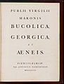
 The roman type of Nicolas Jenson
 -
 De Aetna, printed by Aldus Manutius
 -
 Title page printed by Robert Estienne
 -
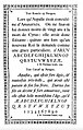
 Great Primer type (c. 18 pt) by Claude Garamond
 -
 Gros Canon type by Garamond
 -
 1611 book, with arabesque ornament border
 -
 Large roman by Hendrik van den Keere, introducing the "Dutch taste" style
 -
 Type by Christoffel van Dijck
 -
 The Romain du roi, the first "transitional" typeface
 -
 Condensed, high x-height types in the "Dutch taste" style, ป. 1720
 -
 Title page by John Baskerville, 1757
 -
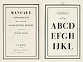
 Alphabet by Pierre-Simon Fournier in his Manuel typographique, 1760s
 -
 Transitional type by Joan Michaël Fleischman of Amsterdam, 1768
 -
 Modern-face types by the Amoretti Brothers, 1797
 -
 Didone type in a book printed by the company of Firmin Didot, 1804
 -
 Bodoni's posthumous Manuale Tipografico, 1818
 -
 Inline modern face
 -
 Display type with pattern inside
 -
 "Fat face" ultra-bold Didone type
 -
 The original Clarendon typeface
 -
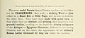
 Display-size slab-serifs
 -
 Miller and Richard's Modernised Old Style, a reimagination of pre-Didone typefaces
 -
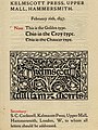 William Morris's Golden Type in the style of Jenson and other typefaces of his Kelmscott Press
 -
 ATF's "Garamond" type, an example of historicist printing
 -
 Memorial plaque by Eric Gill, ป. 1920s
 -
![Sample of the Linotype Legibility Group typefaces, the most popular newspaper typefaces during the twentieth century.[71]](//upload.wikimedia.org/wikipedia/commons/thumb/3/3f/Linotype_Textype_sample_Legibility_Group_typeface.jpg/120px-Linotype_Textype_sample_Legibility_Group_typeface.jpg)
-
 Humanist slab-serif PNM Caecilia on an Amazon Kindle
เทียบกับเอเชียตะวันออก แก้

ในระบบการเขียนภาษาจีนและญี่ปุ่น มีรูปแบบไทป์เฟซทั่วไปที่ใช้ สคริปต์ปกติ สำหรับตัวอักษรจีน เช่น ไทป์เฟซแบบมีเชิงและแบบไม่มีเชิงในโลกตะวันตก ในจีนแผ่นดินใหญ่ หมวดหมู่แบบอักษรที่มีลักษณะคล้ายหยักที่ได้รับความนิยมมากที่สุดสำหรับข้อความเนื้อหาเรียกว่า เพลง (宋体, Songti ); ในญี่ปุ่น รูปแบบเชิงที่ได้รับความนิยมมากที่สุดเรียกว่ามินโช (ญี่ปุ่น: 明朝; โรมาจิ: Minchō; ทับศัพท์: มินโช); และในไต้หวันและฮ่องกง เรียกว่า Ming (明體, Mingti) ชื่อของรูปแบบตัวอักษรเหล่านี้มาจากราชวงศ์ซ่งและราชวงศ์หมิง ซึ่งเป็นช่วงที่การพิมพ์แบบบล็อกเฟื่องฟูในประเทศจีน เนื่องจากลายไม้ บนบล็อกการพิมพ์วิ่งในแนวนอน จึงค่อนข้างง่ายที่จะแกะสลักเส้นแนวนอนด้วยลายไม้ อย่างไรก็ตาม การแกะสลักลวดลายแนวตั้งหรือเอียงนั้นทำได้ยากเพราะลวดลายเหล่านั้นตัดกับลายไม้และแตกหักง่าย ส่งผลให้เกิดแบบอักษรที่มีลายเส้นแนวนอนบางและลายเส้นแนวตั้งหนา[ต้องการอ้างอิง] ตามการประดิษฐ์ตัวอักษรจีน (โดยเฉพาะสไตล์ไคติ) โดยที่การขีดแนวนอนแต่ละครั้งจะสิ้นสุดลงด้วยการเคลื่อนแปรงแบบจุ่ม การสิ้นสุดของลายเส้นแนวนอนก็จะหนาขึ้นเช่นกัน[ต้องการอ้างอิง] การออกแบบเหล่านี้เป็นที่มาของไทป์เฟซซ่งในปัจจุบัน อันมีลักษณะเป็นลายเส้นแนวตั้งหนาตัดกับลายเส้นแนวนอนบางๆ เครื่องประดับรูปสามเหลี่ยมที่ส่วนท้ายของลายเส้นแนวนอนเส้นเดียว และความสม่ำเสมอทางเรขาคณิตโดยรวม
ในรูปแบบตัวอักษรของญี่ปุ่น สิ่งอันเทียบเท่ากับเชิงในตัวอักษรคันจิและคานะถูกเรียกว่า uroko —"เกล็ดปลา" ในภาษาจีน สิ่งอันเทียบเท่ากับเชิงถูกเรียกว่า yǒujiǎotǐ ( 有脚体 "รูปร่างมีขา") หรือ yǒuchènxiàntǐ (有衬线体 “รูปทรงมีเส้นประดับ”)
รูปแบบเอเชียตะวันออกทั่วไปอีกรูปแบบหนึ่งเรียกว่า สีดำ (黑体/體 Hēitǐ) ในภาษาจีนและ Gothic (ญี่ปุ่น: ゴシック体; โรมาจิ: Goshikku-tai) ในภาษาญี่ปุ่น กลุ่มนี้มีลักษณะเป็นเส้นที่มีความหนาเท่ากันในแต่ละจังหวะ ซึ่งเทียบเท่ากับ แบบไม่มีเชิง รูปแบบนี้ถูกนำมาใช้ครั้งแรกในพาดหัวข่าวหนังสือพิมพ์ และมักใช้กับหัวเรื่อง เว็บไซต์ ป้ายโฆษณา และป้ายโฆษณา
ดูเพิ่ม แก้
- โฮโมกลิฟ
- หมิง (ไทป์เฟซ) ซึ่งเป็นสไตล์ที่คล้ายกันในแบบอักษรเอเชีย
- สิ่งอันเทียบเท่ากับเชิงที่เรียกว่า 鱗ความหมายคือ "เกล็ดปลา" ในภาษาญี่ปุ่น
- San Serriffe มุกตลกเกี่ยวกับการพิมพ์อันซับซ้อน
หมายเหตุ แก้
- ↑ Note that this image includes 'Th' ligatures, common in Adobe typefaces but not found in the 16th century.
- ↑ Specifically, Manutius's type, the first type now classified as "Garalde", was not so different from other typefaces around at the time.[16] However, the waves of "Garalde" faces coming out of France from the 1530s onwards did tend to cleanly displace earlier typefaces, and became an international standard.[17][18]
- ↑ Early italics were intended to exist on their own on the page, and so often had very long ascenders and descenders, especially the "chancery italics" of printers such as Arrighi.[29] Jan van Krimpen's Cancelleresca Bastarda typeface, intended to complement his serif family Romulus, was nonetheless cast on a larger body to allow it to have an appropriately expansive feel.
- ↑ Monotype executive Stanley Morison, who commissioned Times New Roman, noted that he hoped that it "has the merit of not looking as if it had been designed by somebody in particular".[44]
- ↑ It should be realised that "Transitional" is a somewhat nebulous classification, almost always including Baskerville and other typefaces around this period but also sometimes including 19th and 20th-century reimaginations of old-style faces, such as Bookman and Plantin, and sometimes some of the later "old-style" faces such as the work of Caslon and his imitators. In addition, of course Baskerville and others of this period would not have seen their work as "transitional" but as an end in itself. Eliason (2015) provides a leading modern critique and assessment of the classification, but even in 1930 A.F. Johnson called the term "vague and unsatisfactory."[45][47]
- ↑ Additional subgenres of Didone type include "fat faces" (ultra-bold designs for posters) and "Scotch Modern" designs (used in the English-speaking world for book and newspaper printing).[48]
- ↑ Early slab-serif types were given a variety of names for branding purposes, such as 'Egyptian', 'Italian', 'Ionic', 'Doric', 'French-Clarendon' and 'Antique', which generally have little or no connection to their actual history. Nonetheless, the names have persisted in use.
อ้างอิง แก้
- ↑ Phinney, Thomas. "Sans Serif: Gothic and Grotesque". TA. Showker Graphic Arts & Design. Showker. คลังข้อมูลเก่าเก็บจากแหล่งเดิมเมื่อ 19 October 2012. สืบค้นเมื่อ 1 February 2013.
- ↑ Samara, Timothy (2004). Typography workbook: a real-world guide to using type in graphic design. Rockport Publishers. p. 240. ISBN 978-1-59253-081-6. เก็บจากแหล่งเดิมเมื่อ 2024-02-09. สืบค้นเมื่อ 2020-10-28.
- ↑ Goldberg, Rob (2000). Digital Typography: Practical Advice for Getting the Type You Want When You Want It. Windsor Professional Information. p. 264. ISBN 978-1-893190-05-4.
- ↑ The Linotype Bulletin. January–February 1921. p. 265. เก็บจากแหล่งเดิมเมื่อ 9 February 2024. สืบค้นเมื่อ 26 October 2011.
- ↑ Boardley, John (18 April 2016). "The first roman fonts". ilovetypography. เก็บจากแหล่งเดิมเมื่อ 27 September 2017. สืบค้นเมื่อ 21 September 2017.
- ↑ Olocco, Riccardo. "The Venetian origins of roman type". Medium. C-A-S-T. เก็บจากแหล่งเดิมเมื่อ 13 November 2023. สืบค้นเมื่อ 27 January 2018.
- ↑ Mosley, James (2006). "Garamond, Griffo and Others: The Price of Celebrity". Bibiologia. เก็บจากแหล่งเดิมเมื่อ 8 December 2015. สืบค้นเมื่อ 3 December 2015.
- ↑ Coles, Stephen. "Top Ten Typefaces Used by Book Design Winners". FontFeed (archived). คลังข้อมูลเก่าเก็บจากแหล่งเดิมเมื่อ 2012-02-28. สืบค้นเมื่อ 2 July 2015.
- ↑ Johnson, A.F. (1931). "Old-Face Types in the Victorian Age" (PDF). Monotype Recorder. 30 (242): 5–15. เก็บ (PDF)จากแหล่งเดิมเมื่อ 5 March 2016. สืบค้นเมื่อ 14 October 2016.
- ↑ "Old Style Serif". เก็บจากแหล่งเดิมเมื่อ 2009-02-21. สืบค้นเมื่อ 2009-06-25.
- ↑ อ้างอิงผิดพลาด: ป้ายระบุ
<ref>ไม่ถูกต้อง ไม่มีการกำหนดข้อความสำหรับอ้างอิงชื่อVenetian origins of roman type3 - ↑ Boardley, John (7 February 2014). "Unusual fifteenth-century fonts: part 1". i love typography. เก็บจากแหล่งเดิมเมื่อ 13 September 2017. สืบค้นเมื่อ 22 September 2017.
- ↑ Boardley, John (July 2015). "Unusual fifteenth-century fonts: part 2". i love typography. เก็บจากแหล่งเดิมเมื่อ 30 September 2017. สืบค้นเมื่อ 22 September 2017.
- ↑ "Type anatomy: Family Classifications of Type". SFCC Graphic Design department. Spokane Falls Community College. คลังข้อมูลเก่าเก็บจากแหล่งเดิมเมื่อ 7 August 2015. สืบค้นเมื่อ 14 August 2015.
- ↑ Dixon, Catherine (2002), "Twentieth Century Graphic Communication: Technology, Society and Culture", Typeface classification, Friends of St Bride, คลังข้อมูลเก่าเก็บจากแหล่งเดิมเมื่อ 2014-10-26, สืบค้นเมื่อ 2015-08-14
- ↑ อ้างอิงผิดพลาด: ป้ายระบุ
<ref>ไม่ถูกต้อง ไม่มีการกำหนดข้อความสำหรับอ้างอิงชื่อThe first roman fonts - ↑ Amert, Kay (April 2008). "Stanley Morison's Aldine Hypothesis Revisited". Design Issues. 24 (2): 53–71. doi:10.1162/desi.2008.24.2.53. S2CID 57566512.
- ↑ The Aldine Press: catalogue of the Ahmanson-Murphy collection of books by or relating to the press in the Library of the University of California, Los Angeles : incorporating works recorded elsewhere. Berkeley [u.a.]: Univ. of California Press. 2001. pp. 22–25. ISBN 978-0-520-22993-8.
[On the Aldine Press in Venice changing over to types from France]: the press followed precedent; popular in France, [these] types rapidly spread over western Europe.
- ↑ Twardoch, Slimbach, Sousa, Slye (2007). Arno Pro (PDF). San Jose: Adobe Systems. คลังข้อมูลเก่าเก็บจากแหล่งเดิม (PDF)เมื่อ 30 August 2014. สืบค้นเมื่อ 14 August 2015.
{{cite book}}: CS1 maint: multiple names: authors list (ลิงก์) - ↑ 20.0 20.1 อ้างอิงผิดพลาด: ป้ายระบุ
<ref>ไม่ถูกต้อง ไม่มีการกำหนดข้อความสำหรับอ้างอิงชื่อThe first roman fonts3 - ↑ อ้างอิงผิดพลาด: ป้ายระบุ
<ref>ไม่ถูกต้อง ไม่มีการกำหนดข้อความสำหรับอ้างอิงชื่อVenetian origins of roman type4 - ↑ Olocco, Riccardo. "Nicolas Jenson and the success of his roman type". Medium. C-A-S-T. เก็บจากแหล่งเดิมเมื่อ 9 February 2024. สืบค้นเมื่อ 21 September 2017.
- ↑ 23.0 23.1 Vervliet, Hendrik D.L. (2008). The palaeotypography of the French Renaissance. Selected papers on sixteenth-century typefaces. 2 vols. Leiden: Koninklijke Brill NV. pp. 90–91, etc. ISBN 978-90-04-16982-1.
[On Robert Estienne's typefaces of the 1530s]: Its outstanding design became standard for Roman type in the two centuries to follow...From the 1540s onwards French Romans and Italics had begun to infiltrate, probably by way of Lyons, the typography of the neighbouring countries. In Italy, major printers replaced the older, noble but worn Italian characters and their imitations from Basle.
- ↑ Carter, Harry (1969). A View of Early Typography up to about 1600 (Second edition (2002) ed.). London: Hyphen Press. pp. 72–4. ISBN 0-907259-21-9.
De Aetna was decisive in shaping the printers' alphabet. The small letters are very well made to conform with the genuinely antique capitals by emphasis on long straight strokes and fine serifs and to harmonise in curvature with them. The strokes are thinner than those of Jenson and his school...the letters look narrower than Jenson's, but are in fact a little wider because the short ones are bigger, and the effect of narrowness makes the face suitable for octavo pages...this Roman of Aldus is distinguishable from other faces of the time by the level cross-stroke in 'e' and the absence of top serifs from the insides of the vertical strokes of 'M', following the model of Feliciano. We have come to regard his small 'e' as an improvement on previous practice.
- ↑ Bergsland, David (29 August 2012). "Aldine: the intellectuals begin their assault on font design". The Skilled Workman. เก็บจากแหล่งเดิมเมื่อ 17 January 2022. สืบค้นเมื่อ 14 August 2015.
- ↑ Boardley, John (25 November 2014). "Brief notes on the first italic". i love typography. เก็บจากแหล่งเดิมเมื่อ 19 October 2017. สืบค้นเมื่อ 21 September 2017.
- ↑ Vervliet, Hendrik D. L. (2008). The Palaeotypography of the French Renaissance: Selected Papers on Sixteenth-century Typefaces. BRILL. pp. 287–289. ISBN 978-90-04-16982-1. เก็บจากแหล่งเดิมเมื่อ 2023-11-01. สืบค้นเมื่อ 2017-09-21.
- ↑ Lane, John (1983). "The Types of Nicholas Kis". Journal of the Printing Historical Society: 47–75.
Kis's Amsterdam specimen of c. 1688 is an important example of the increasing tendency to regard a range of roman and italic types as a coherent family, and this may well have been a conscious innovation. But italics were romanised to a greater degree in many earlier handwritten examples and occasional earlier types, and Jean Jannon displayed a full range of matching roman and italic of his own cutting in his 1621 specimen...[In appendix] [György] Haiman notes that this trend is foreshadowed in the specimens of Guyot in the mid-sixteenth century and Berner in 1592.
- ↑ Vervliet, Hendrik D. L. (2008). The Palaeotypography of the French Renaissance: Selected Papers on Sixteenth-century Typefaces. BRILL. pp. 287–319. ISBN 978-90-04-16982-1. เก็บจากแหล่งเดิมเมื่อ 2023-11-01. สืบค้นเมื่อ 2017-09-21.
- ↑ Shen, Juliet. "Searching for Morris Fuller Benton". Type Culture. เก็บจากแหล่งเดิมเมื่อ 11 April 2017. สืบค้นเมื่อ 11 April 2017.
- ↑ "antiqua". Oxford English Dictionary (3rd ed.). Oxford University Press. กันยายน 2005.
- ↑ Eisenstein, Elizabeth (12 September 2005). The Printing Revolution in Early Modern Europe. Cambridge University Press. pp. 123–163. ISBN 978-0-521-84543-4.
- ↑ "Renner Antiqua – Reviving a serif typeface from the designer of Futura". Linotype.
Antiqua is a term used in German to denote serif typefaces, many of them oldstyles (Garamond-Antiqua, Palatino-Antiqua, etc.). The word is used in very much the same way as "roman" [is used] in English-speaking typography to differentiate between upright and italic typefaces in a family.
- ↑ 34.0 34.1 Johnson, A. F. (1939). "The 'Goût Hollandois'". The Library. s4-XX (2): 180–196. doi:10.1093/library/s4-XX.2.180.
- ↑ Updike, Daniel Berkeley (1922). "Chapter 15: Types of the Netherlands, 1500-1800". Printing Types: Their History, Forms and Uses: Volume 2. Harvard University Press. pp. 6–7. สืบค้นเมื่อ 18 December 2015.
- ↑ "Type History 1". Typofonderie Gazette. เก็บจากแหล่งเดิมเมื่อ 23 December 2015. สืบค้นเมื่อ 23 December 2015.
- ↑ 37.0 37.1 Mosley, James. "Type and its Uses, 1455-1830" (PDF). Institute of English Studies. คลังข้อมูลเก่าเก็บจากแหล่งเดิม (PDF)เมื่อ 9 October 2016. สืบค้นเมื่อ 7 October 2016.
Although types on the 'Aldine' model were widely used in the 17th and 18th centuries, a new variant that was often slightly more condensed in its proportions, and darker and larger on its body, became sufficiently widespread, at least in Northern Europe, to be worth defining as a distinct style and examining separately. Adopting a term used by Fournier le jeune, the style is sometimes called the 'Dutch taste', and sometimes, especially in Germany, 'baroque'. Some names associated with the style are those of Van den Keere, Granjon, Briot, Van Dijck, Kis (maker of the so-called 'Janson' types), and Caslon.
อ้างอิงผิดพลาด: ป้ายระบุ<ref>ไม่สมเหตุสมผล มีนิยามชื่อ "Type and its Uses, 1455-1830" หลายครั้งด้วยเนื้อหาต่างกัน - ↑ de Jong, Feike; Lane, John A. "The Briot project. Part I". PampaType. TYPO, republished by PampaType. เก็บจากแหล่งเดิมเมื่อ 12 June 2018. สืบค้นเมื่อ 10 June 2018.
- ↑ Paul Shaw (18 April 2017). Revival Type: Digital Typefaces Inspired by the Past. Yale University Press. pp. 85–98. ISBN 978-0-300-21929-6. เก็บจากแหล่งเดิมเมื่อ 9 February 2024. สืบค้นเมื่อ 22 June 2017.
- ↑ Morison, Stanley (1937). "Type Designs of the Past and Present, Part 3". PM: 17–81. คลังข้อมูลเก่าเก็บจากแหล่งเดิมเมื่อ 2017-09-04. สืบค้นเมื่อ 4 June 2017.
- ↑ Jan Middendorp (2004). Dutch Type. 010 Publishers. pp. 27–29. ISBN 978-90-6450-460-0.
- ↑ Corbeto, A. (25 September 2009). "Eighteenth Century Spanish Type Design". The Library. 10 (3): 272–297. doi:10.1093/library/10.3.272.
- ↑ Unger, Gerard (1 January 2001). "The types of François-Ambroise Didot and Pierre-Louis Vafflard. A further investigation into the origins of the Didones". Quaerendo. 31 (3): 165–191. doi:10.1163/157006901X00047.
- ↑ Alas, Joel. "The history of the Times New Roman typeface". Financial Times. คลังข้อมูลเก่าเก็บจากแหล่งเดิมเมื่อ 2022-12-10. สืบค้นเมื่อ 16 January 2016.
- ↑ 45.0 45.1 Johnson, Alfred F. (1930). "The Evolution of the Modern-Face Roman". The Library. s4-XI (3): 353–377. doi:10.1093/library/s4-XI.3.353.
- ↑ Johnston, Alastair (2014). Transitional Faces: The Lives & Work of Richard Austin, type-cutter, and Richard Turner Austin, wood-engraver. Berkeley: Poltroon Press. ISBN 978-0918395320. เก็บจากแหล่งเดิมเมื่อ 11 February 2017. สืบค้นเมื่อ 8 February 2017.
- ↑ Eliason, Craig (October 2015). ""Transitional" Typefaces: The History of a Typefounding Classification". Design Issues. 31 (4): 30–43. doi:10.1162/DESI_a_00349. S2CID 57569313.
- ↑ Shinn, Nick. "Modern Suite" (PDF). Shinntype. คลังข้อมูลเก่าเก็บจากแหล่งเดิม (PDF)เมื่อ 25 February 2021. สืบค้นเมื่อ 11 August 2015.
- ↑ Shaw, Paul (10 February 2011). "Overlooked Typefaces". Print magazine. เก็บจากแหล่งเดิมเมื่อ 22 June 2015. สืบค้นเมื่อ 2 July 2015.
- ↑ Ovink, G.W. (1971). "Nineteenth-century reactions against the didone type model - I". Quaerendo. 1 (2): 18–31. doi:10.1163/157006971x00301.
- ↑ Ovink, G.W. (1971). "Nineteenth-century reactions against the didone type model - II". Quaerendo. 1 (4): 282–301. doi:10.1163/157006971x00239.
- ↑ Ovink, G.W. (1 January 1972). "Nineteenth-century reactions against the didone type model-III". Quaerendo. 2 (2): 122–128. doi:10.1163/157006972X00229.
- ↑ Frazier, J.L. (1925). Type Lore. Chicago. p. 14. สืบค้นเมื่อ 24 August 2015.
- ↑ 54.0 54.1 "HFJ Didot introduction". Hoefler & Frere-Jones. เก็บจากแหล่งเดิมเมื่อ 14 August 2015. สืบค้นเมื่อ 10 August 2015.
- ↑ "HFJ Didot". Hoefler & Frere-Jones. เก็บจากแหล่งเดิมเมื่อ 8 July 2013. สืบค้นเมื่อ 10 August 2015.
- ↑ Leonidas, Gerry. "A primer on Greek type design". Gerry Leonidas/University of Reading. คลังข้อมูลเก่าเก็บจากแหล่งเดิมเมื่อ 4 January 2017. สืบค้นเมื่อ 14 May 2017.
- ↑ "GFS Didot". Greek Font Society. คลังข้อมูลเก่าเก็บจากแหล่งเดิมเมื่อ 21 August 2015. สืบค้นเมื่อ 10 August 2015.
- ↑ Eskilson, Stephen J. (2007). Graphic design : a new history. New Haven: Yale University Press. p. 25. ISBN 9780300120110.
- ↑ Pané-Farré, Pierre. "Affichen-Schriften". Forgotten-Shapes. เก็บจากแหล่งเดิมเมื่อ 12 June 2018. สืบค้นเมื่อ 10 June 2018.
- ↑ Johnson, Alfred F. (1970). "Fat Faces: Their History, Forms and Use". Selected Essays on Books and Printing. pp. 409–415.
- ↑ Phinney, Thomas. "Fat faces". Graphic Design and Publishing Centre. คลังข้อมูลเก่าเก็บจากแหล่งเดิมเมื่อ 9 October 2015. สืบค้นเมื่อ 10 August 2015.
- ↑ Kennard, Jennifer (3 January 2014). "The Story of Our Friend, the Fat Face". Fonts in Use. เก็บจากแหล่งเดิมเมื่อ 9 November 2021. สืบค้นเมื่อ 11 August 2015.
- ↑ "Sentinel: historical background". Hoefler & Frere-Jones. เก็บจากแหล่งเดิมเมื่อ 5 September 2015. สืบค้นเมื่อ 15 July 2015.
- ↑ Challand, Skylar. "Know your type: Clarendon". IDSGN. เก็บจากแหล่งเดิมเมื่อ 24 February 2021. สืบค้นเมื่อ 13 August 2015.
- ↑ Phinney, Thomas. "Most Overlooked: Chaparral". Typekit Blog. Adobe Systems. เก็บจากแหล่งเดิมเมื่อ 16 February 2020. สืบค้นเมื่อ 7 March 2019.
- ↑ Lupton, Ellen (12 August 2014). Type on Screen: A Critical Guide for Designers, Writers, Developers, and Students. Princeton Architectural Press. p. 16. ISBN 978-1-61689-346-0. เก็บจากแหล่งเดิมเมื่อ 9 February 2024. สืบค้นเมื่อ 7 March 2019.
- ↑ Bringhurst, Robert (2002). The Elements of Typographic Style (2nd ed.). Hartley & Marks. pp. 218, 330. ISBN 9780881791327.
- ↑ Gray, Nicolete (1976). Nineteenth-century Ornamented Typefaces.
- ↑ Lupton, Ellen (15 April 2014). Thinking with Type. Chronicle Books. p. 23. ISBN 9781616890452.
- ↑ Frutiger, Adrian (8 May 2014). Typefaces – the complete works. Walter de Gruyter. pp. 26–35. ISBN 9783038212607.
- ↑ 71.0 71.1 Hutt, Allen (1973). The Changing Newspaper: typographic trends in Britain and America 1622-1972 (1. publ. ed.). London: Fraser. pp. 100–2 etc. ISBN 9780900406225.
the majority of the world's newspapers are typeset in one or another of the traditional Linotype 'Legibility Group', and most of the rest in their derivatives.
บรรณานุกรม แก้
- Robert Bringhurst, The Elements of Typographic Style, version 4.0 (Vancouver, BC, Canada: Hartley & Marks Publishers, 2012), ISBN 0-88179-211-X.
- Harry Carter, A View of Early Typography: Up to about 1600 (London: Hyphen Press, 2002).
- Father Edward Catich, The Origin of the Serif: Brush Writing and Roman Letters, 2nd ed., edited by Mary W. Gilroy (Davenport, Iowa: Catich Gallery, St. Ambrose University, 1991), ISBN 9780962974021.
- Nicolete Gray, Nineteenth Century Ornamented Typefaces, 2nd ed. (Faber, 1976), ISBN 9780571102174.
- Alfred F. Johnson, Type Designs: Their History and Development (Grafton, 1959).
- Stan Knight, Historical Types: From Gutenberg to Ashendene (Oak Knoll Press, 2012), ISBN 9781584562986.
- Ellen Lupton, Thinking with Type: A Critical Guide for Designers, Writers, Editors, & Students, 2nd ed. (New York: Princeton Architectural Press, 2010), ISBN 9781568989693, <www.thinkingwithtype.com>.
- Indra Kupferschmid, "Some Type Genres Explained," Type, kupferschrift.de (2016-01-15).
- Stanley Morison, A Tally of Types, edited by Brooke Crutchley et al., 2nd ed. (London: Cambridge University Press, 1973), ISBN 978-0-521-09786-4. (on revivals of historical typefaces created by the British company Monotype)
- ———, “Type Designs of the Past and Present,” was serialized in 4 parts in 1937 in PM Magazine (the last 2 are available online):
- Sébastien Morlighem, The 'modern face' in France and Great Britain, 1781-1825: typography as an ideal of progress (thesis, University of Reading, 2014), download link เก็บถาวร 2022-09-28 ที่ เวย์แบ็กแมชชีน
- Sébastien Morlighem, Robert Thorne and the Introduction of the 'modern' fat face, 2020, Poem, and presentation
- James Mosley, Ornamented types: twenty-three alphabets from the foundry of Louis John Poucheé, I.M. Imprimit, 1993
- Paul Shaw, Revival Type: Digital Typefaces Inspired by the Past (Brighton: Quid Publishing, 2017), ISBN 978-0-300-21929-6.
- Walter Tracy, Letters of Credit: A View of Type Design, 2nd ed. (David R. Godine, 2003), ISBN 9781567922400.
- Daniel Berkeley Updike, Printing Types, their History, Forms, and Use: A Study in Survivals, 2 vols. (Cambridge: Harvard University Press, 1922), volume 1 and volume 2—now outdated and known for a strong, not always accurate dislike of Dutch and modern-face printing, but extremely comprehensive in scope.
- H. D. L. Vervliet, The Palaeotypography of the French Renaissance: Selected Papers on Sixteenth-Century Typefaces, 2 vols., Library of the Written Word series, No. 6, The Handpress World subseries, No. 4 (Leiden: Koninklijke Brill NV, 2008-11-27), ISBN 978-90-04-16982-1.
- ———, Sixteenth Century Printing Types of the Low Countries, Annotated catalogue (Leiden: Koninklijke Brill NV, 1968-01-01), ISBN 978-90-6194-859-9.
- ———, French Renaissance Printing Types: A Conspectus (Oak Knoll Press, 2010).
- ———, Liber librorum: 5000 ans d'art du livre (Arcade, 1972).
- Translation: Fernand Baudin, The Book Through Five Thousand Years: A Survey, edited by Hendrik D. L. Vervliet (London: Phaidon, 1972).
- James Mosley's reading lists: "Type and its Uses, 1455–1830", 1830-2000